ספרי אינפוגרפיקה


Oliver Uberti and James Cheshire
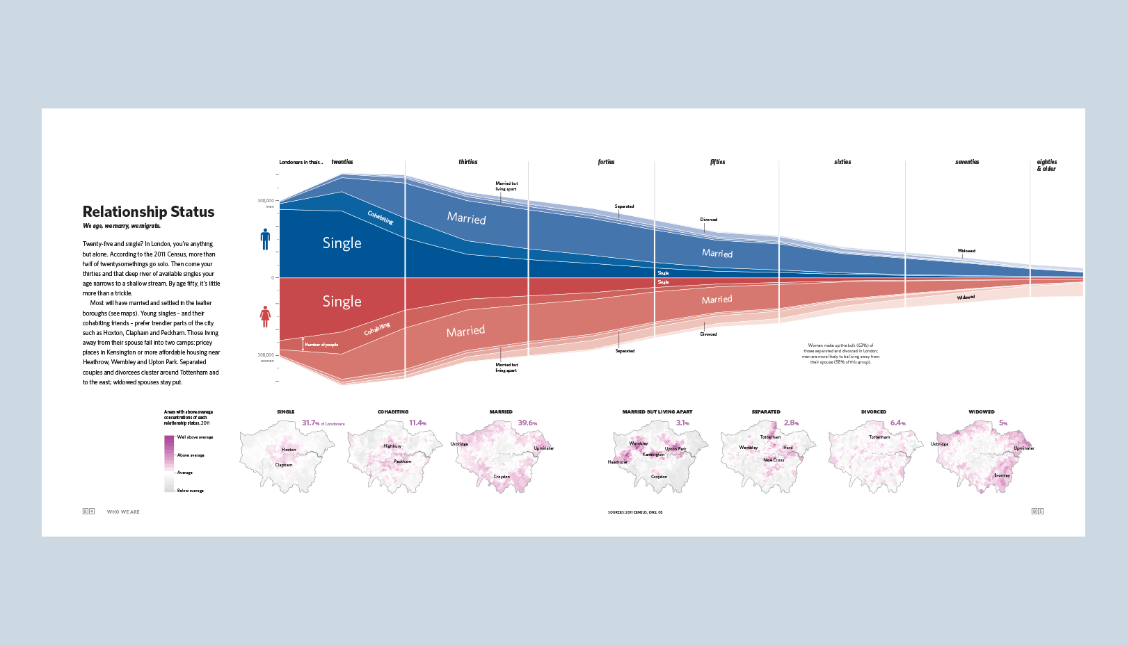
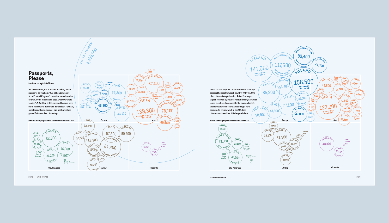
London, The Information Capital
Oliver Uberti and geographer James Cheshire joined forces to bring you a series of new maps and graphics charting life in a city like never before. When do police helicopters catch criminals? Which borough of London is the happiest? Is ‘czesc’ becoming a more common greeting than ‘salaam’? Oliver and James could tell you, but they’d rather show you. By combining millions of data points with stunning design, they investigate how flights stack over Heathrow, who lives longest, and where Londoners love to tweet. The result? One hundred portraits of an old city in a very new way.

Gareth Cook
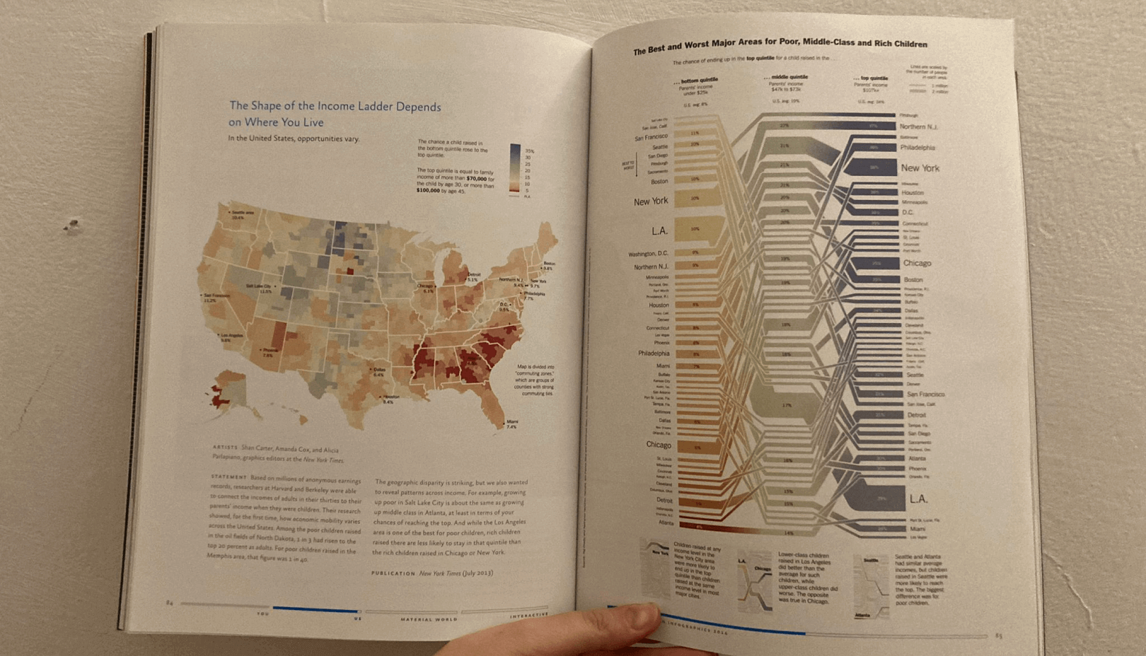
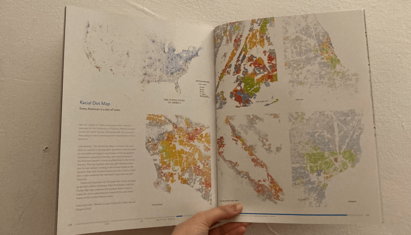
The Best American Infographics 2014
The rise of infographics across virtually all print and electronic media reveals patterns in our lives and worlds in fresh and surprising ways. As we find ourselves in the era of big data, where information moves faster than ever, infographics provide us with quick, often influential bursts of art and knowledge — to digest, tweet, share, go viral. Best American Infographics 2014 captures the finest examples, from the past year, of this mesmerizing new way of seeing and understanding our world. Guest introducer Nate Silver brings his unparalleled expertise and lively analysis to this visually compelling new volume.

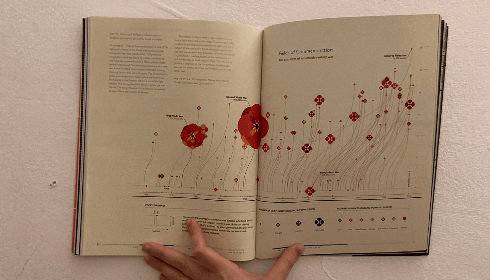
Valentina D'Efilippo and James Ball
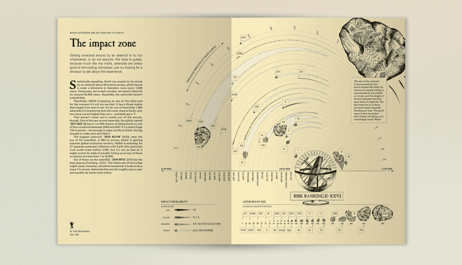
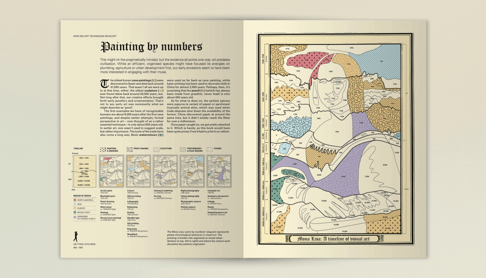
The Infographic History of the World
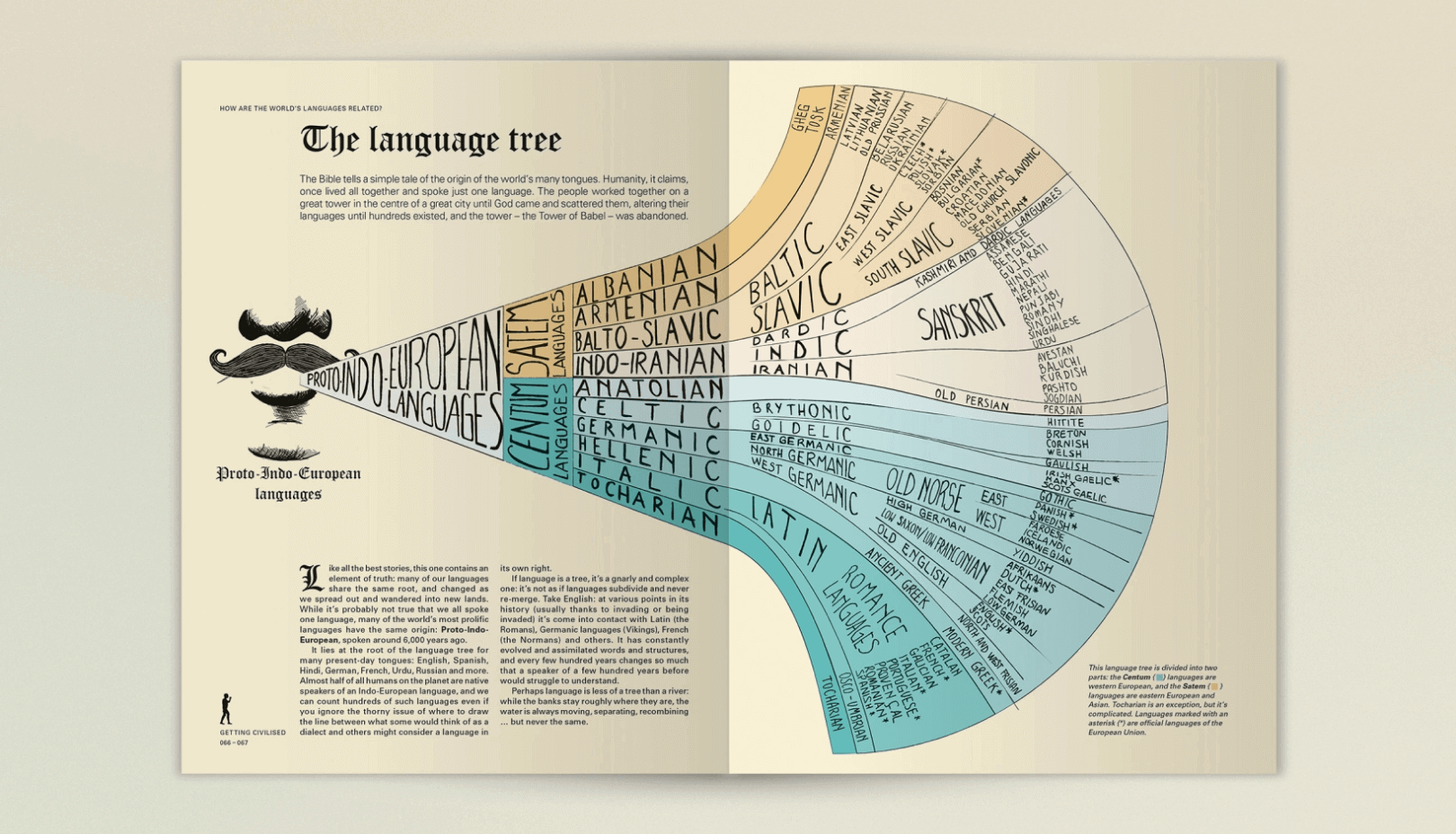
The History of the World, but not as you know it. A new type of history is here – all 13.8 billion years of it, exploded into a visually jaw-dropping feast of facts, trends and timelines that tell you everything you’d ever want to know about the history of the world.
From the primordial soup to the technological revolution of the 21st century, interesting stuff has been going on; and ever since prehistoric man scratched the first tally markings into a damp cave wall, we’ve been counting and measuring it all.
Which historic warriors conquered the most territory, killed the most people, or had the largest empire? When did everything evolve? Which languages are related to which? What’s been invented and when? Where are we being born, and what are we dying of? Which countries are eating all the food, causing all the pollution and taking all the drugs?
A story of civilization and barbarism, of war and peace, this is history done in a new way – a beautifully designed collection of the most insightful and revealing trends that tell us what the human race has been up to, and where we’re heading.
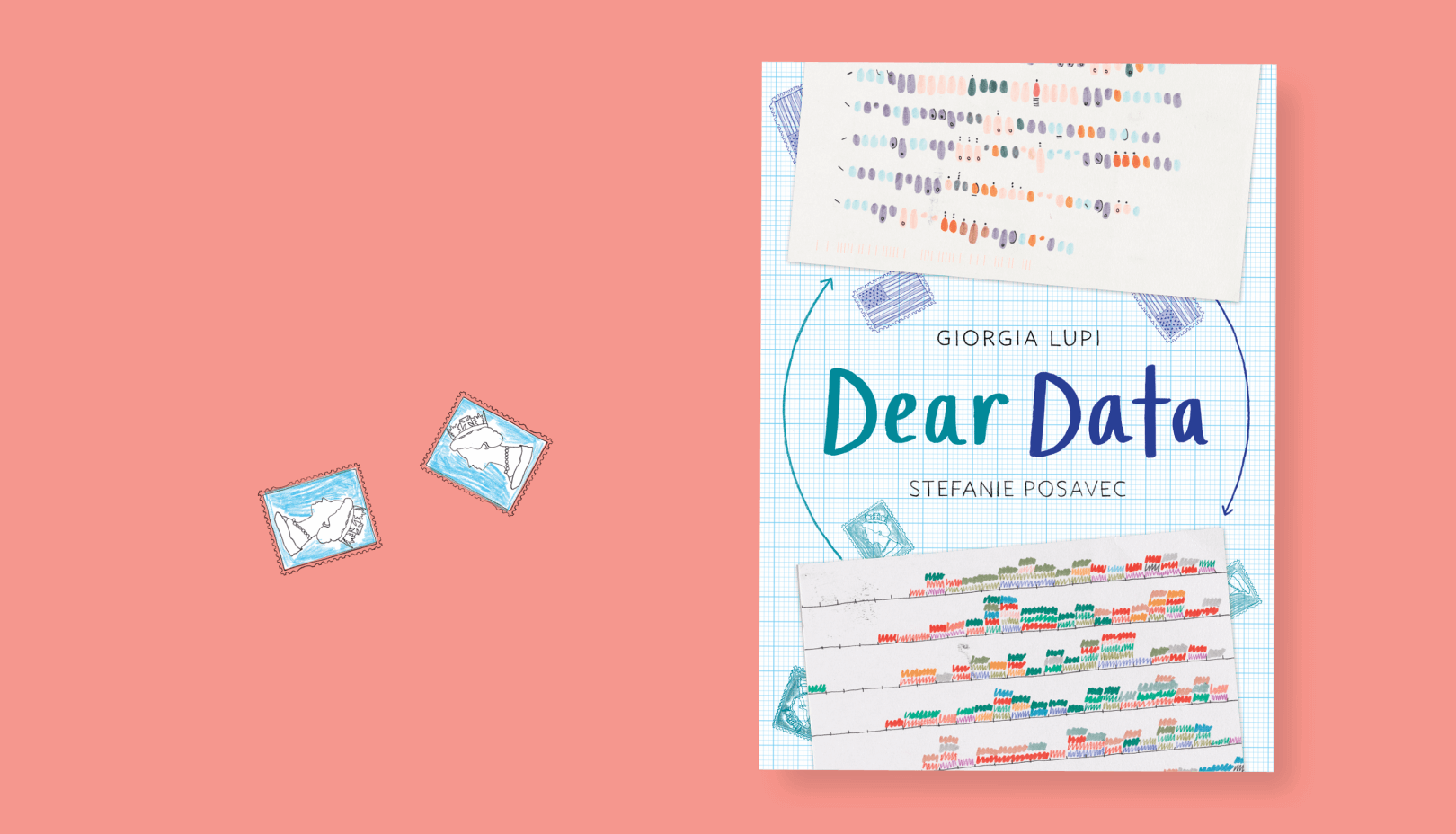
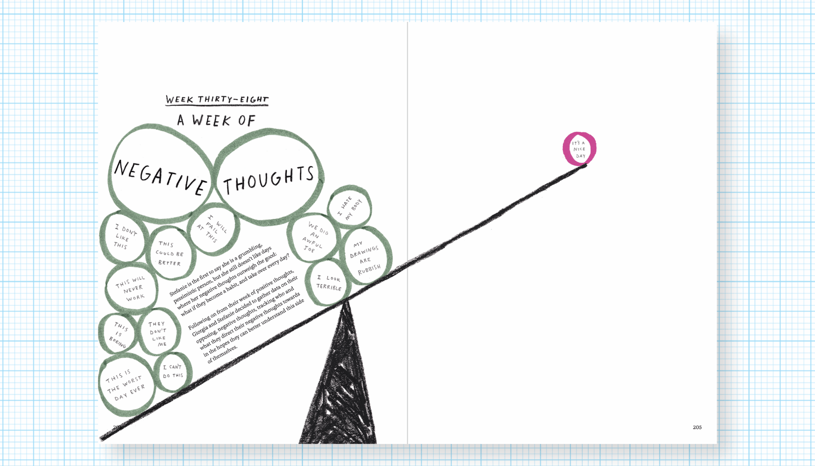

Giorgia Lupi and Stefanie Posavec
Dear Data
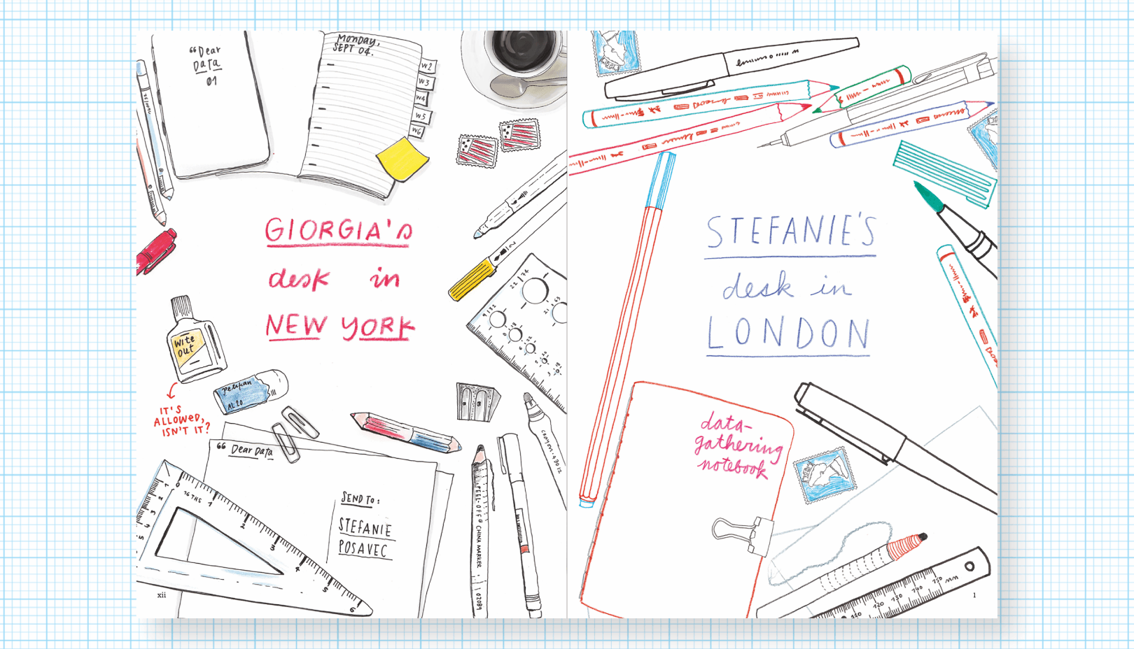
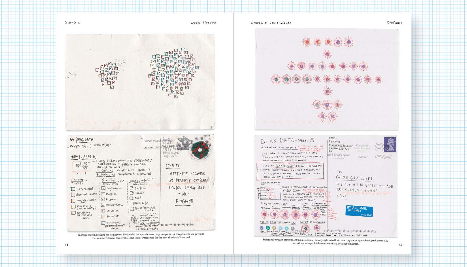
Each week, and for a year, we collected and measured a particular type of data about our lives, used this data to make a drawing on a postcard-sized sheet of paper, and then dropped the postcard in an English “postbox” (Stefanie) or an American “mailbox” (Giorgia)!
Over the fifty-two weeks, the collecting of data about our lives became a kind of ritual. We would spend the week noticing and noting down our activities or thoughts, before translating this information into a hand-drawn visualization.

Javier Errea
Visual Journalism
Infographics from the World's Best Newsrooms and Designers
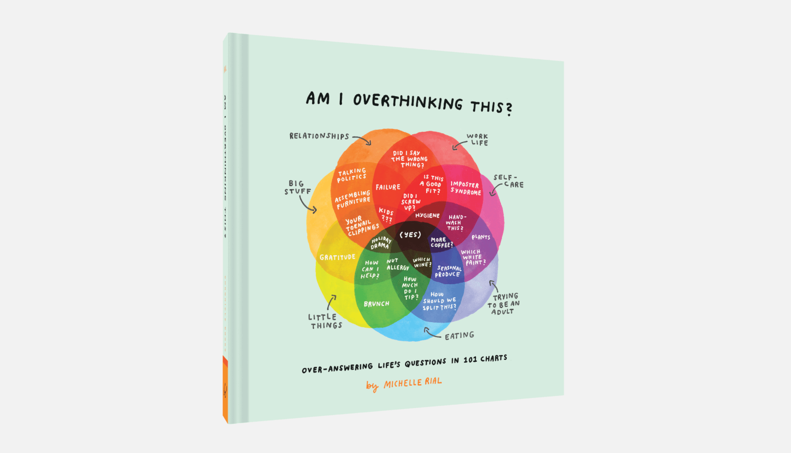
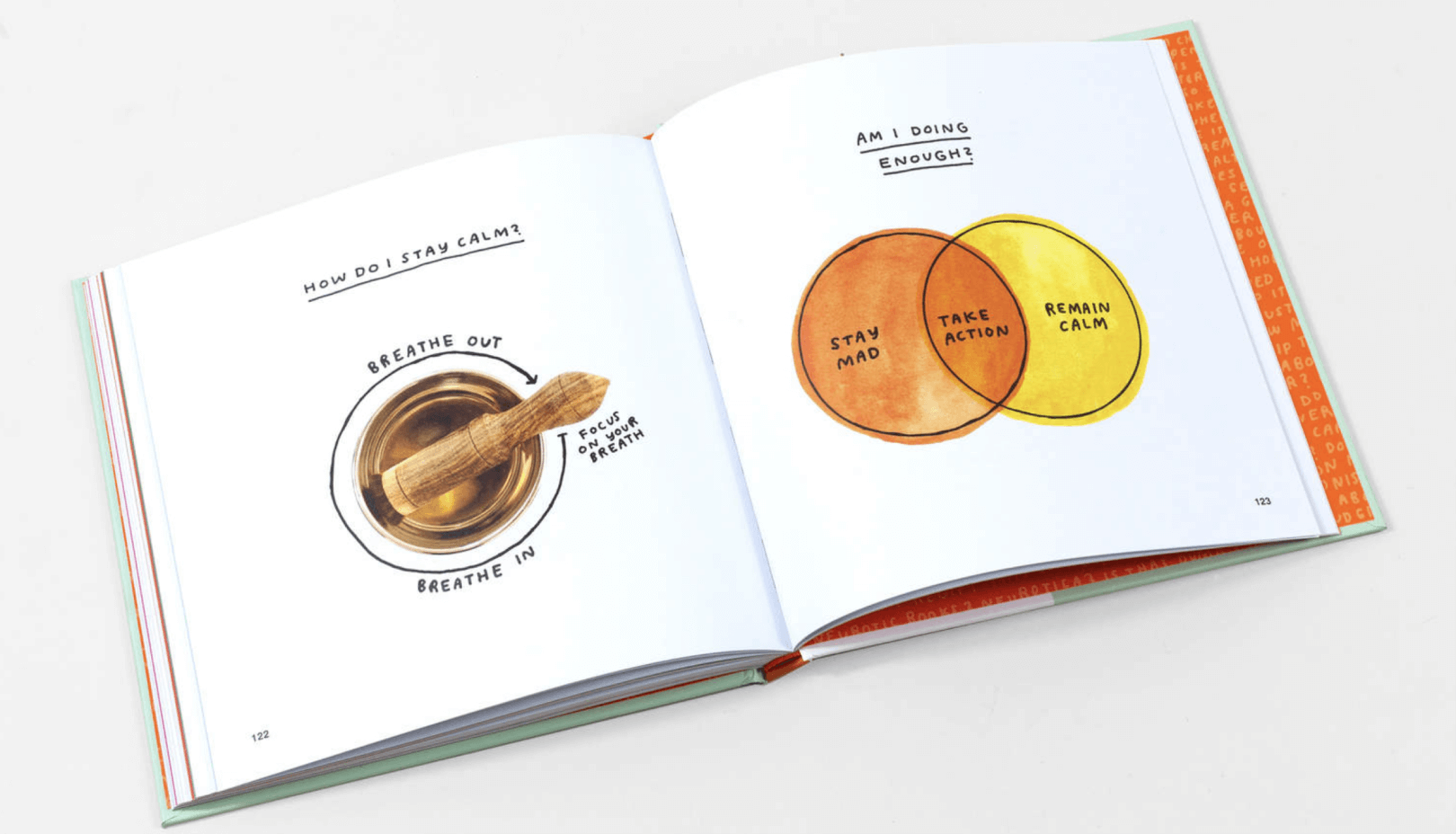
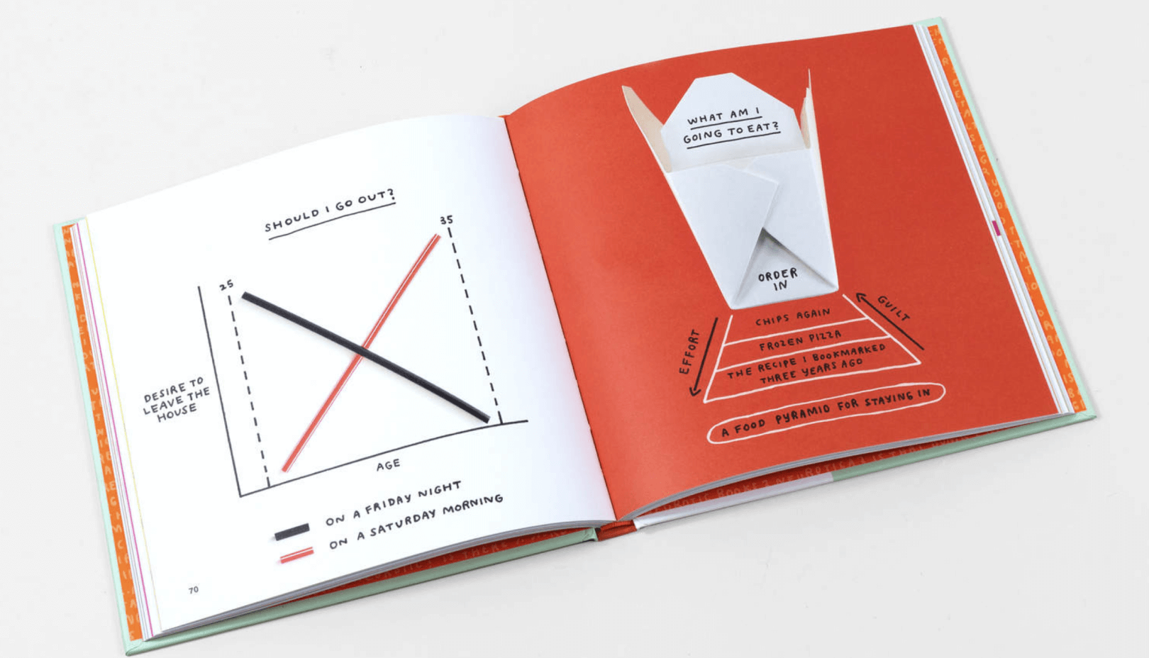
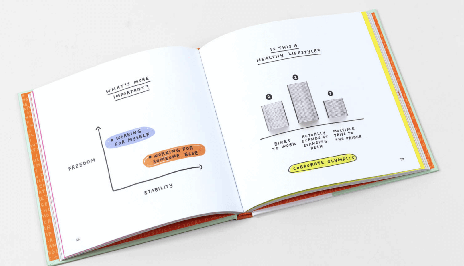

Michelle Rial
?Am I Overthinking This
Michelle Rial makes charts out of things and now she's made a book out of them.
Did I screw up? How do I achieve work-life balance? Am I eating too much cheese? Do I have too many plants?
Through artful charts and funny, insightful questions, Michelle delivers a playful take on the little dilemmas that loom large in the mind of every adult.
Am I Overthinking This? brings whimsical charm to topics big and small, and offers solidarity for the stressed, answers for the confused, and a good laugh for all.
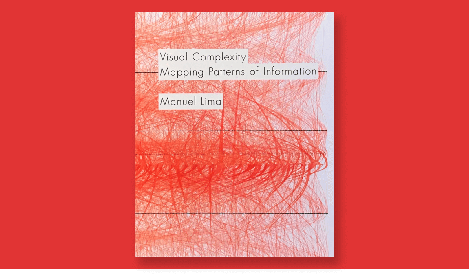
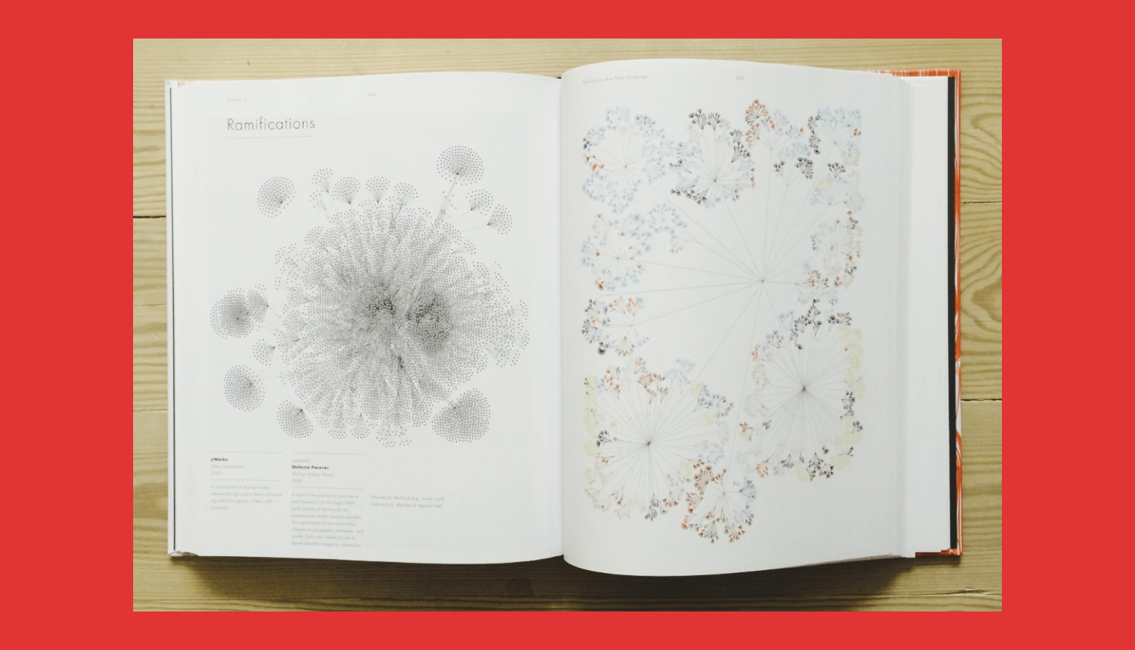


Manuel Lima
Visual Complexity
Mapping Patterns of Information
This groundbreaking 2011 book – the first to combine a thorough history of information visualization with a detailed look at today's most innovative applications – clearly illustrates why making meaningful connections inside complex data networks has emerged as one of the biggest challenges in twenty-first-century design.
From diagramming networks of friends on Facebook to depicting interactions among proteins in a human cell, Visual Complexity presents one hundred of the most interesting examples of information visualization by the field's leading practitioners.
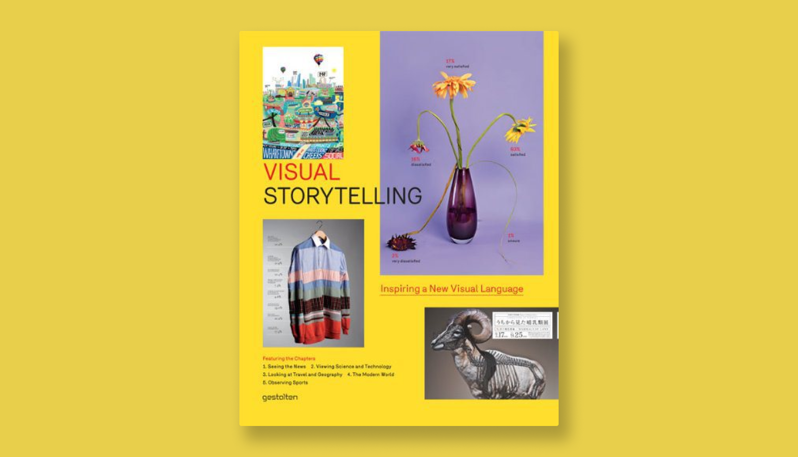
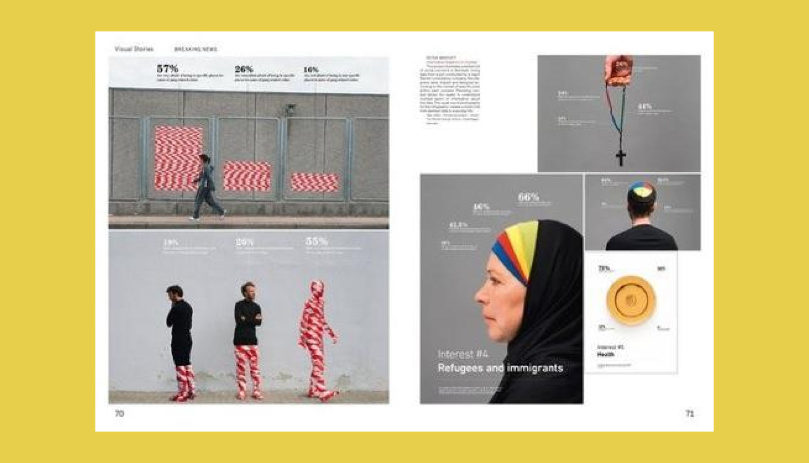
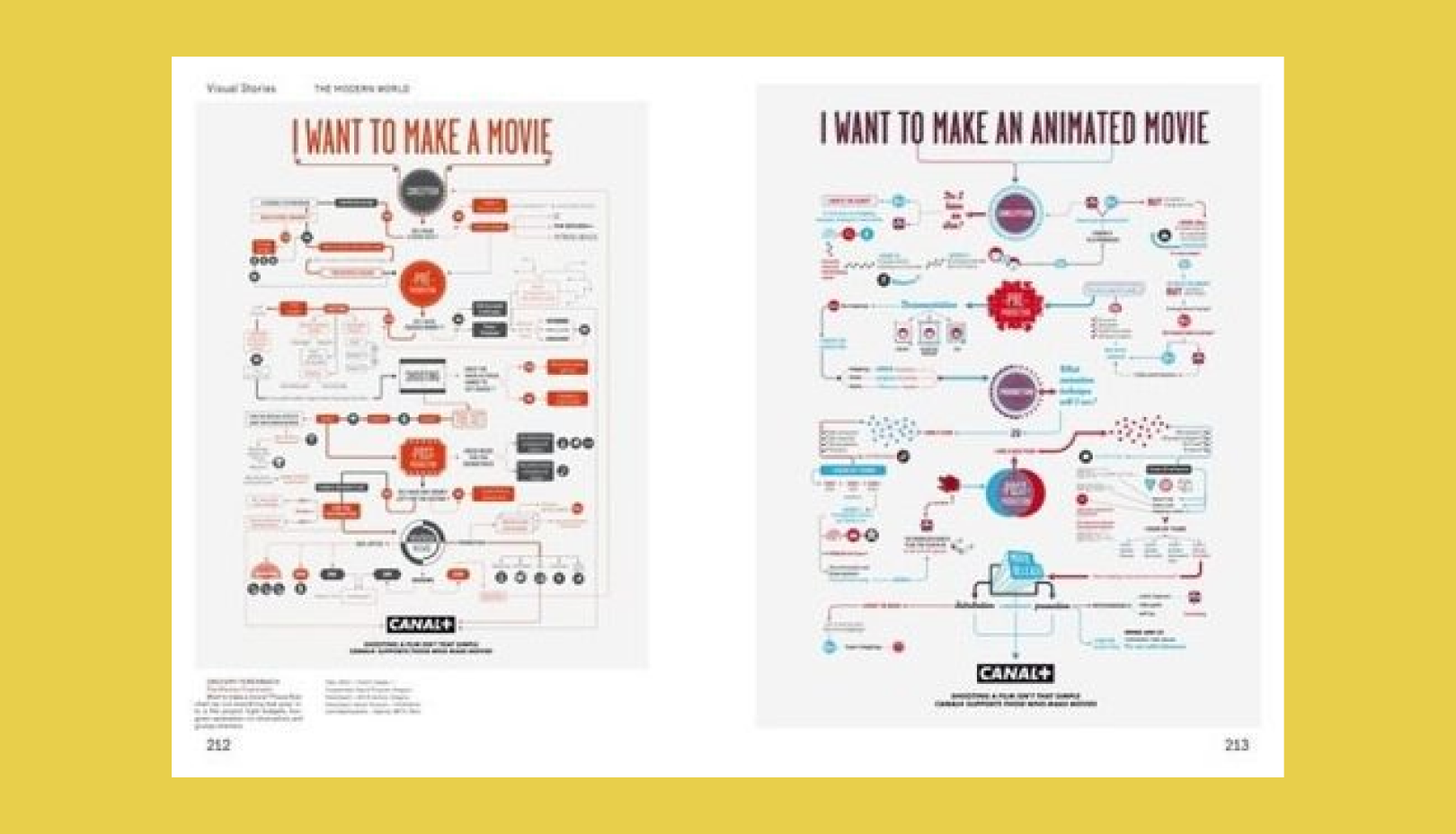


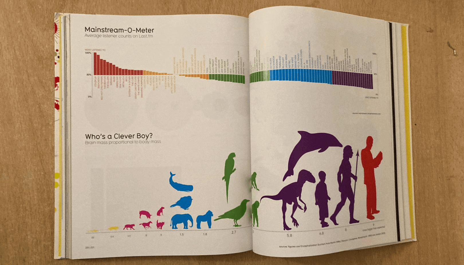
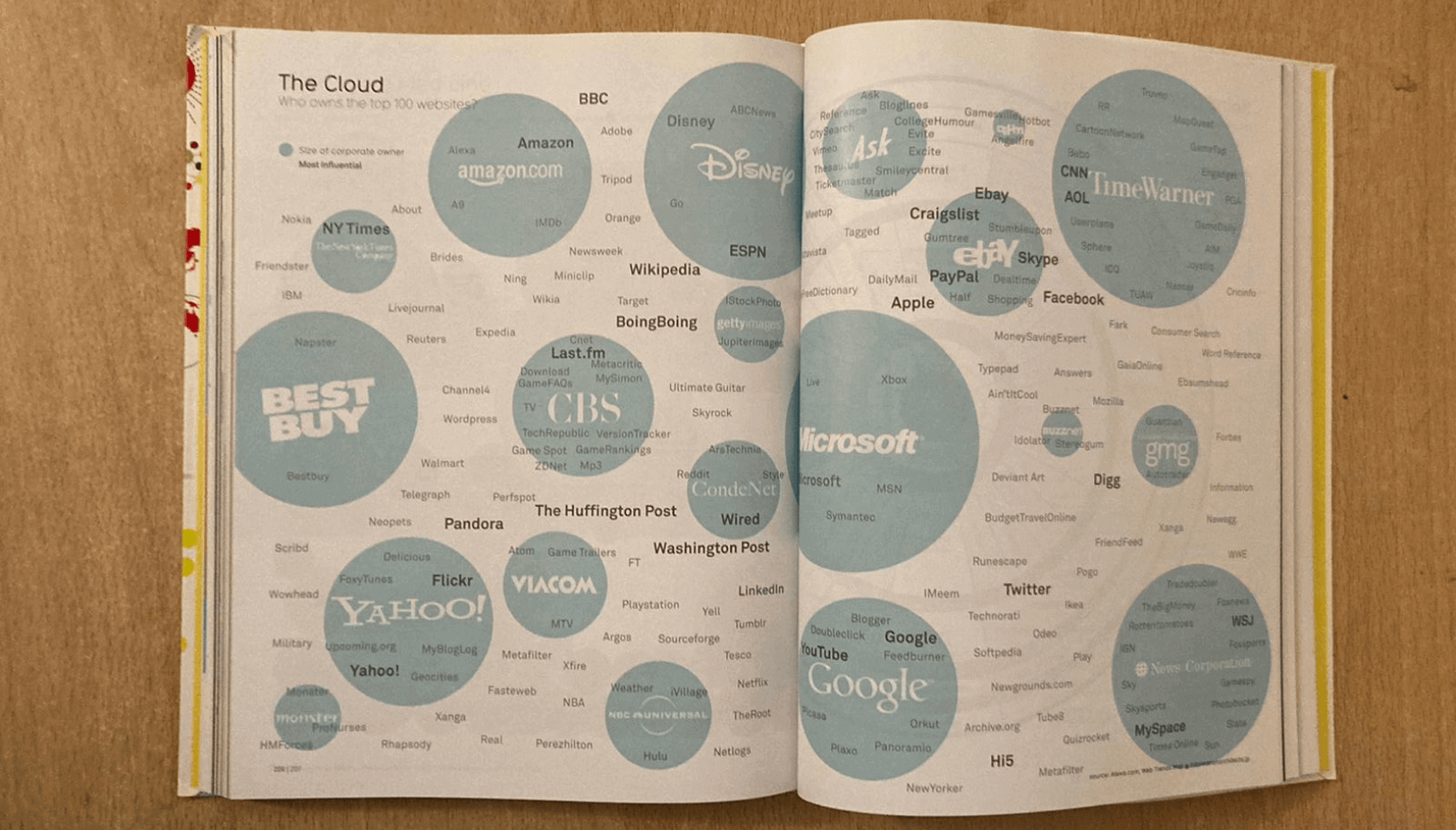
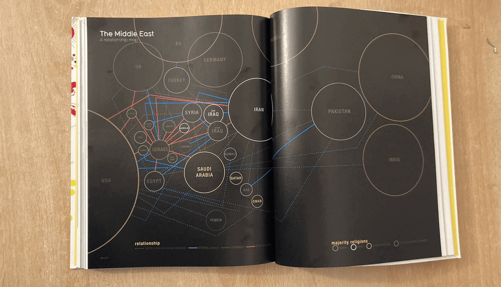
Robert Klanten, Sven Ehmann, Franz Schulze
Visual Storytelling
Inspiring a New Visual Language
More and more data is being collected. We can access ever more information at any time and from any place. The fundamental challenge now is how to extract the most valuable news, the most surprising findings, and the most relevant stories from the flood of information that is available to us.
A new generation of designers, illustrators, data journalists, and graphic editors is addressing this challenge head on. They are expanding the creative scope of existing techniques in visual storytelling – using graphic design, infographics, illustration, and photography to convey information in the most elegant, entertaining, and informative way. The main idea behind visual storytelling is to take familiar image contexts and use them in a new way. By penetrating meaning and creating associations, abstract correlations can be visualized in a manner that is both easy to understand and aesthetically innovative. Today, visual storytelling is being used intensively in newspapers, magazines, websites, advertising, business reports, and museums.
Visual Storytelling is the first book to focus solely on contemporary and experimental manifestations of visual forms that can be classified as such. The rich selection of cutting-edge examples featured here is put into context with an introduction and text features by magazine expert Andrew Losowsky as well as interviews with the New York Times, Francesco Franchi, Density Design, Carl Kleiner, Antoine Corbineau, Golden Section Graphics, Les Graphiquants, and Peter Grundy. The inspiring, insightful, interactive, and entertaining work and texts collected in Visual Storytelling reveal how the contextualization of information is pushing the envelope of today’s design and aesthetics.